Last updated on April 11, 2024
This tutorial, up until now, focused on the non-visual aspect of development, or as I would call it, the plumbing. It’s now time to put the visuals aspects using some of these plumbing we’ve built onto our storyboard.
Storyboard is a feature built into Xcode that represents the screens in an app and the transitions between them. It is similar to Interface Builder with the added advantage of defining transitions. If you have done any WinForm development, both storyboard and interface builder concepts will be easy to understand. If you’re coming from Java AWT and/or swing, concepts may be very foreign to you. Luckily, Google did manage to improve UI development on the android platform. Too bad, it wouldn’t replace swing anytime soon. Once you get used to it, you’re really going to hate developing UIs in Java AWT and/or swing. I certainly did.
Now that I got my dig on Java swing and AWT, let’s leverage the mockups we’ve created from our earlier tutorial: Putting Pen to Paper.
1. Create Storyboard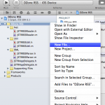 Right-click “DZone RSS” group under project DZone RSS and select “New File…”. In the “choose a template for your new file”, select “User Interface” on left panel, “Storyboard” on right panel, and click next. Leave Device Family option as “iPhone” and click Next. Name the storyboard as “MainStoryboard” under “Save As” field and click “create”. MainStoryboard should now appear under “DZone RSS” group.
2. Add Navigation Controller
The starting controller for our application will be the UINavigationController. With UINavigationController, we can stack many types of ViewControllers on top of it. In our case, as described in earlier post, UITabbarController will be stacked on top next.
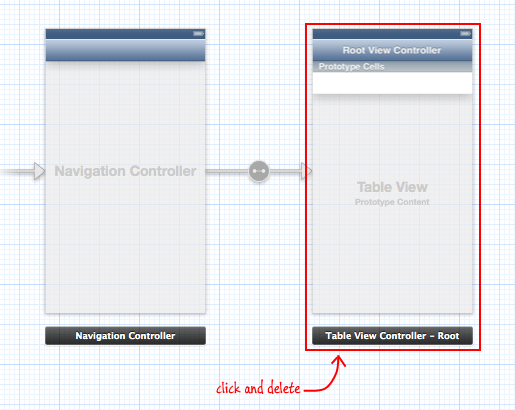
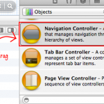 To add UINavigationController, simply drag Navigation Controller from the object browser on your right bottom corner to the storyboard. By default, the root view controller will be UITableViewController. Since we will be using UITabbarController, you can select “Table View Controller – Root” and delete it.
On the Attribute Inspector, you’ll notice “Is Initial View Controller” checked. Only one ViewController within the storyboard can have this checked. This will inform our application which view controller should be loaded first on startup.
2. Add Tab Bar Controller
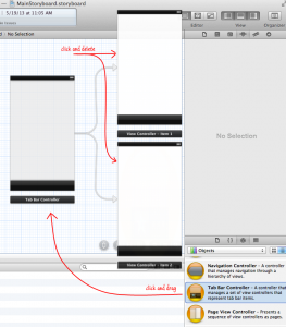
From the object browser, drag Tab Bar Controller to Storyboard. By default Tab Bar Controller comes with two UIViewControllers. However, we don’t want UIViewControllers. We want UICollectionViewController instead so select and delete each of the view controller attached to Tab Bar Controller.
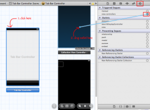
Now drag two Collection View Controllers to the storyboard. Select Tab Bar Controller from storyboard and go to Connections inspector. Select the outlet next to view controllers under Triggered Segues and drag it over to the top Collection View Controller.
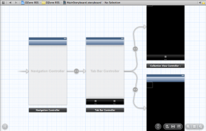
Repeat this for the second collection view. Now, click on Navigation Controller, select “root view controller” outlet and drag it over to Tab Bar Controller. It should now look like below.
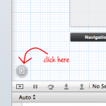 Since our Tab Bar is black, we need to change the navigation bar to black as well. While Navigation Controller is selected, go to Attribute inspector and change the Top Bar from “Inferred” to “Back Navigation Bar”.
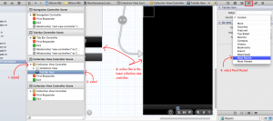
Now that we have our segues defined for the tabs, let’s change the icon on the tab bar. If you have your document outline closed, open them by clicking on the left corner. Expand the first Collection View Controller Scene and select Tab Bar Item. Then, go to Attribute inspector. If the selected Tab Bar Item from document outline is pointing to the bottom collection view on the storyboard, change the identifier from “Custom” to “Most Recent”. Otherwise, change it to Featured.
Repeat this for the other Collection View Controller.
Let’s take a moment and run what we have. But first, we need to delete some code from JSTRAppDelegate.m and update our project setting. First, click on DZone RSS project. Under targets, select DZone RSS and go to Summary tab. Under iPhone / iPod Deployment Info, select “MainStoryboard” next to the “Main Storyboard” field.
Next, open JSTRAppDelegate and delete everything in the method application:didFinishLaunchingWithOptions except for the following lines.
- (BOOL)application:(UIApplication *)application didFinishLaunchingWithOptions:(NSDictionary *)launchOptions
{
  JSTRRSSReader *reader = [[JSTRRSSReader alloc] init];
  [reader startRequest];

  return YES;
}
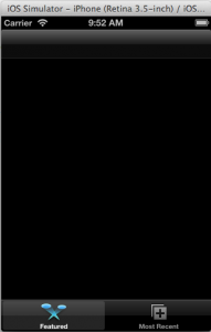
Since our storyboard will handle launching of the Main View Controller, we don’t need to instantiate the UIWindow in our code and make it visible. On run, we now have our app with navigation bar and tab bar with two items.
You may be asking why I choose to use Collection View over Table View. The main reason is that I want to reuse many of my UI components for the iPad version of this app. With Collection view, I can define and reuse my Collection Cell so that they appear in multiple columns and rows as oppose to single column cells in a table view. In iPad view, a single column view is a waste of space. It’s a design decision that you too have to make when you start implementing your own app.
3. Define Collection Cell Layout
From Collection View Controller we will use as “Feature” tab, select the child component named “Collection View”. On the right panel, go to Size inspector and update the Collection View Size details. We want our cell to be 314 by 314.
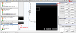
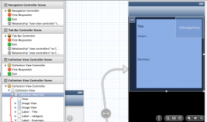
Select the child component under Collection View named “Collection View Cell” and add the following components:
- drag a View from Object browser to be used as background tile (size: 275 x 290; bound to x=30 & y=10). Set the background color to RBG value of 172, 204, and 252.
- drag 2 ImageViews from Object browser to be used as avatar (size: 24x 24; bound to x=0 & y=0) and thumbnail (size: 120 x 90; bound to x=194 & y=0)
- drag 3 Labels from Object browser to be used as title (size: 115 x 60; bound to x=34 & y=10), category (size: 155 x 20; bound to x=34 & y=70), and summary (size: 267 x 177; bound to x=34 & y=90)
Once you’ve updated the size attributes, we need to make small changes to our UILabel components: title, category, and summary. Under attribute inspector, we want title to have font sized to 12, lines set to 3, and line breaks to “Word Wrap”. For category, font sized to 10. For summary, font sized to 14, lines to 9, and Line Breaks set to “Word Wrap”. This will enable our app to properly layout our text on screen.
The final layout should the below screenshot.
4. Create a Custom Collection Cell Class
In order to assign values to these components, we need to create a custom class. Following earlier tutorial, create a group called “UI” and associate it to a specific file system folder UI. Then, add a new file called JSTRCollectionViewCell, a subclass of UICollectionViewCell, to this group. This will be a simple class with 5 outlets. We will only modify the header file and leave the implementation class as is.
#import <UIKit/UIKit.h>

@interface JSTRCollectionViewCell : UICollectionViewCell

@property (retain, nonatomic) IBOutlet UILabel *title;
@property (retain, nonatomic) IBOutlet UILabel *category;
@property (retain, nonatomic) IBOutlet UILabel *summary;
@property (retain, nonatomic) IBOutlet UIImageView *avatar;
@property (retain, nonatomic) IBOutlet UIImageView *thumbnail;

@end
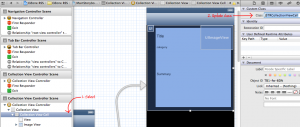
From the storyboard, select the Collection View Cell, show identity inspector, and update Class name from UICollectionViewCell to JSTRCollectionViewCell.
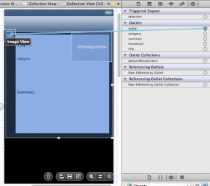
When you click on connection inspector, you’ll see the 5 outlets defined in your custom class. For each outlet, select and drag it over to their relevant component. Below, I am dragging the avatar outlet to top left corner where I want my image to reside.
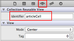
Finally, I need to specify the reusable view identifier. This identifier will be used by the Collection View Controller to retrieve and instance of this cell so that we can assign data to them. To do this, go to the attribute inspector and set the identifier to “articleCell”.
5. Create a Custom Collection View Class
Like custom collection cell, we now need a custom collection view controller class. This class will be used to retrieve the parsed RSS file from the file system and populate each cell that’s rendered within collection view controller.
Once again, add a new file called “JSTRCollectionViewControllerâ€, a subclass of UICollectionViewController, to the “UI” group. There’s one delegate we must define in our header for our custom class: UICollectionViewDataSource. Additionally, we want to create an instance variable to hold the content of our parsed RSS file.
#import <UIKit/UIKit.h>

@interface JSTRCollectionViewController : UICollectionViewController <UICollectionViewDataSource>
{
  NSMutableArray *_articleList;
}

@end
First, let’s retrieve the content of the parsed RSS file when our UI component becomes visible by updating viewDidLoad method. Additionally, since we are referencing JSTRRSSUtil class, don’t forget to import this class.
- (void)viewDidLoad
{
  [super viewDidLoad];

  // Do any additional setup after loading the view.
  NSString *fileName = [NSString stringWithFormat:@"%@/popular.rss", [JSTRRSSUtil getDocumentRoot]];
  _articleList = [NSArray arrayWithContentsOfFile:fileName];
}
Next, we need to implement the required UICollectionViewDataSource protocols.
#pragma mark - UICollectionViewDataSourceDelegate
- (NSInteger) numberOfSectionsInCollectionView:(UICollectionView *)collectionView
{
  return 1;
}
The above method numberOfSectionsInCollectionView tells our collection view controller, how many sections we will have. In our case, it will be one. Note, had we decided not to use Tab Bar Controller and displayed both Featured and Latest Links on a single collection view controller, we could have done so by having 2 sections.
In our next method, we inform our collection view controller how many items will be in the selected section. Since we only have one section, I don’t need to know the value of the parameter section. I just return the size of our array of articles.
- (NSInteger) collectionView:(UICollectionView *)collectionView numberOfItemsInSection:(NSInteger)section
{
  return [_articleList count];
}
Finally, we retrieve each cell within our section and populated it. In the first line, you’ll notice the same value “articleCell” I provided as our reusable identifier in prior step. Using dequeueReusableCellWithReuseIdentifier, an instance of the cell defined by our indexPath is returned. I then assign the necessary values of the cell’s components via the already defined outlets. Additionally, since we have a reference to JSTRCollectionViewCell, don’t forget to import this header.
- (UICollectionViewCell *) collectionView:(UICollectionView *)collectionView cellForItemAtIndexPath:(NSIndexPath *)indexPath
{
  JSTRCollectionViewCell *cell = [collectionView dequeueReusableCellWithReuseIdentifier:@"articleCell"
forIndexPath:indexPath];
  NSDictionary *item = [_articleList objectAtIndex:indexPath.item];

  // retrieve the URL of user's avatar and assign it to the UIImageView
  NSURL *userImgURL = [NSURL URLWithString:[item objectForKey:@"userimage"]];
  NSData *userImgData = [NSData dataWithContentsOfURL:userImgURL];
  UIImage *userImage = [UIImage imageWithData:userImgData];
  [cell.avatar setImage:userImage];

  // set the text of title UILabel
  cell.title.text = [NSString stringWithFormat:@"%@\n\n\n\n", [item objectForKey:@"title"]];

  // since category is an array, join it into a string separated by comma
  NSArray *catList = [item objectForKey:@"category"];
  NSString *catString = [catList componentsJoinedByString:@","];
  cell.category.text = [NSString stringWithFormat:@"%@", catString];

  // set the text of summary UILabel
  cell.summary.text = [NSString stringWithFormat:@"%@\n\n\n\n\n\n\n\n\n", [item objectForKey:@"description"]];

  // retrieve the URL of thumbnail and assign it to the UIImageView
  NSURL *thumbImgURL = [NSURL URLWithString:[item objectForKey:@"thumbnail"]];
  NSData *thumbImgData = [NSData dataWithContentsOfURL:thumbImgURL];
  UIImage *thumbImage = [UIImage imageWithData:thumbImgData];
  [cell.thumbnail setImage:thumbImage];

  return cell;
}
@end
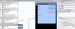
Last but not least, we need to assign this custom class to the Collection View Controller. Similar to Collection View Cell, select the Collection View Controller and update the custom class in the identify inspector to JSTRCollectionViewController from UICollectionViewController
6. Let’s Run
When you run now, the RSS content will appear in our app. Granted, we haven’t implemented the latest links tab but you should have the following appear.
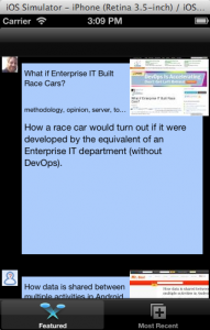
Currently, this app uses system font. You can change the front by selecting each UILabel control from storyboard and change the size and type from attribute inspector. Go ahead, I’ll take no offense to your customizations.
